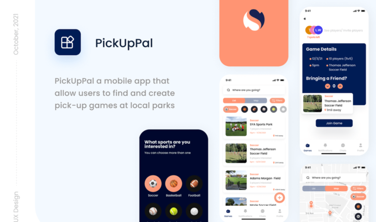
PickUp Pal is a mobile app that allows users to find and create pick-up games at local parks and athletic facilities efficiently.
This was a group project done for my UI/UX design class with undergraduate and graduate students majoring in interaction design.
My Role
I was the team lead
I worked on information architecture, Low fidelity design
As a group, we worked on research and designs collaboratively
The Problem
Athletes experience inconveniences coordinating people, locations, and times to play pick-up sports.
How might we develop an intuitive experience for local community athletes of different skill levels who are in search of sports at public park facilities?
The Goal
Client asks:
Increase use of public park facilities
Facilitate participation in team sports without high commitment
Optimize team formations focusing on building and supporting personal connections
Based on Research:
Create and find games to join (player, location, sport, skill levels)
Form relationships and foster communication between players to connect about pick-up sports
Research
Discovery Interviews
As a team, we each conducted discovery interviews to learn about the experiences of athletes who’ve played pick-up sports and what their expectations are for an app to streamline the process of engaging in pick-up sports
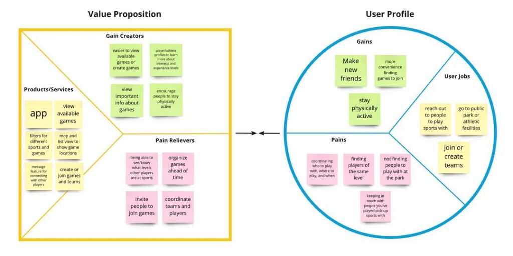
Pain Points
Coordinating finding peeople to play with, where to play, and when to play
Having a hard time keeping in touch with athletes playing pick-up sports
Not finding people to play with at the park
Finding athletes of similar playing level
Gain Points
Make it more convenient to find pick-up games at local parks
Create and join teams to play with
Communicate with players before games starts
Keep in contact with athletes you’ve played pick-up games with
Value Proposition Canvas
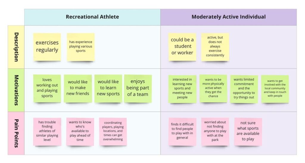
Archetypes
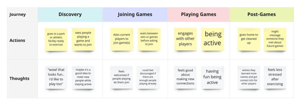
Journey Map
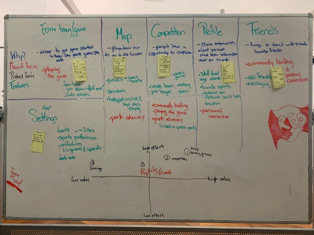
Design
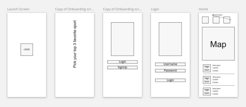
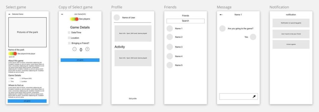
Paper wireframes & Brainstorming
Digital Wireframes
Accessibility Considerations
Checked color contrast with commonly used text and background colors with WebAIM
Other ideas we considered for next steps include having the search bar closer to the bottom of the screen to make it easier to reach and making the contrast of the navigation bar higher/including another form of feedback to let users know where they are in the app
Initial Prototypes
Usability Study Round 1
Conducted our first round of usability testing with Maze. Our main priority was to make sure people could easily join games.
Mission: Join a game
0% direct success
57.1% (4 testers) indirect success
42.9% (3 testers) gave up
What we learnt from heat maps and talking to testers
Testers had trouble clicking on points on the map
Testers explored other parts of the prototype before coming back to complete the mission (joining a game)
Some testers are directional-challenged and suggested having a list view to view scheduled games
Iterating Based on Feedback
Made areas around points on the map view clickable instead of only having a small point clickable
Included a list view in addition to map view
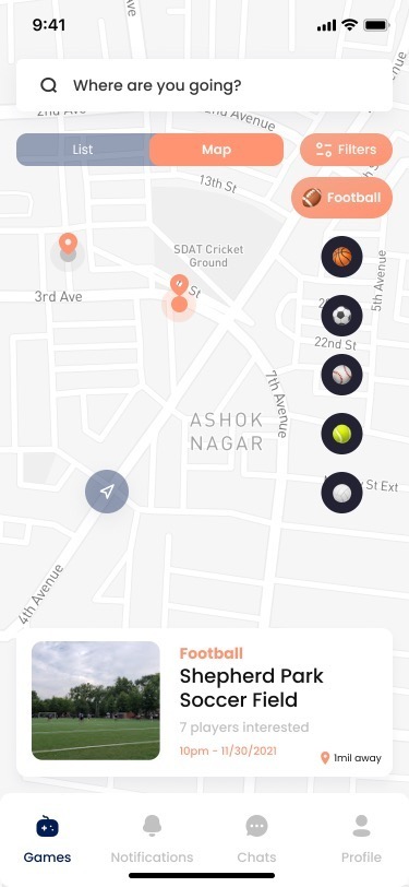
Toggle between list and map view
Made all available sport visible on list and map view
Included filters for open spots, proximity, and game times
Removed points on the map that were not clickable
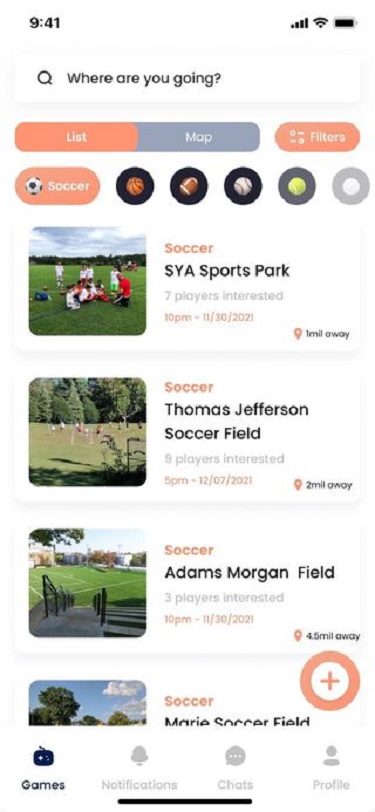
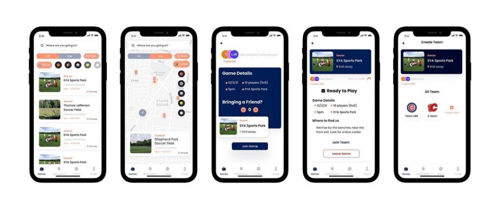
List View
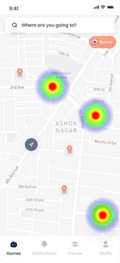
Map View
Usability Study Round 2
Conducted usability testing with Maze again.
Mission: Join a game – Map View
54.5% (12 testing) direct success
31.8% (7 testers) indirect success
13.6% (3 testers) gave up
Key Takeaways
Validated that list view may be more intuitive for some people than the map view based on data we gathered from testing
Continue refining map view and seek feedback on ways it could be easier to use
Make clearer guidelines/instructions for unmoderated testing to ensure that testers focus on completing tasks instead of exploring the prototype freely
Consider moderated testing and feedback sessions to learn about things we might not learn from unmoderated testing
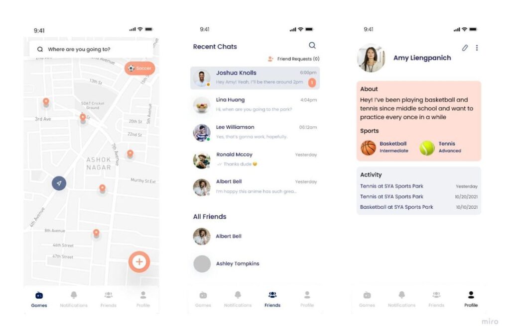
High Fidelity Mockups
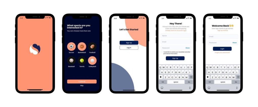
Login and Onboarding
Games and Teams
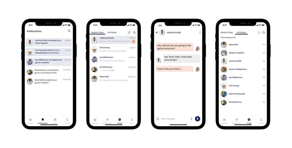
Notifications and Chats/Friends
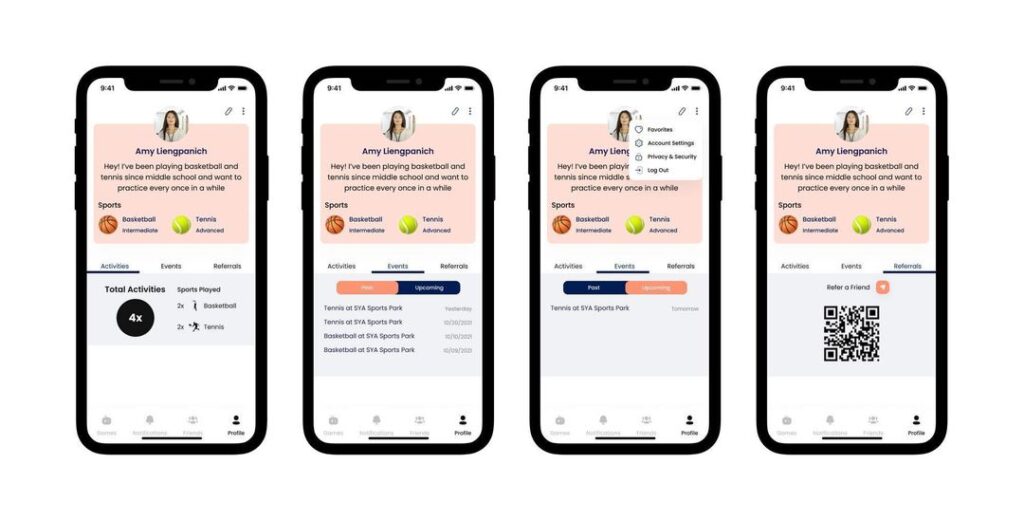
User Profile
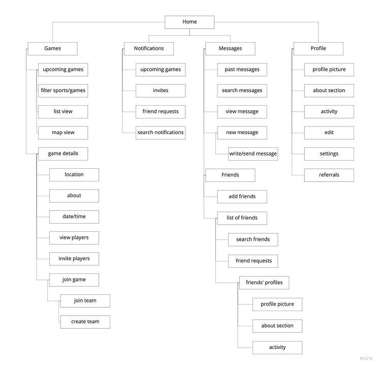
Information Architecture
Reflection
What went well
Communication as a team
We were all responsive to texts/emails and communicated respectfully during group work time, which helped us get all of our idea out and stay productive.
Contributing equally to research and design processes
We all worked through most of the research and design processes as a group. Bouncing ideas off of each other and having direct feedback while in person or over Zoom was helpful for making decisions.
Outside of group work, we divided up research and design task so that everyone could also spend some time working independently before coming back to discus what we did.
Time management
Initially, we thought six weeks wouldn’t be enough to complete everything. We ended up completing, but we planned ahead and tried our best to meet our weekly goals in order to have a minimum viable product (MVP) to present
Preview clickable prototype on figma
Here is the interactive prototype for you to play around with. here