Delta Airways: Mobile app redesign case study
Project Overview
This project aims to conduct a comprehensive evaluation of the Fly Delta mobile app’s user interface (UI) with a focus on improving the user experience for two core functionalities: flight booking and check-in. By analyzing the app’s current design and functionality, identifying usability issues, and benchmarking against competitor apps, we will propose design enhancements to optimize the overall user journey.
By following the double-diamond design methodology, I aimed to enhance the Delta passenger’s in-flight journey through the Fly Delta app. My solution, visualized in a high-fidelity prototype, centered on a unified mobile platform that integrates various in-flight services and information.
Delta Airline is one of the best airlines in United State of America. Throughout this project I would be making a redesign of the existing app and provide improvement based of on interviews conducted with users.
Project Description
The Fly Delta app puts the power to manage your flights right in your pocket. This free app eliminates the hassle of waiting in lines by letting you:
- Book flights: Shop for domestic and international flights, easily plan trips with the “Explore” screen, and pay with miles or dollars using stored payment methods.
- Check in and manage flights: Skip the check-in counter, access your digital boarding pass instantly (add it to your Apple Wallet with a double-click!), and even track checked bags in real-time.
- Navigate the airport: Never get lost again! Use the built-in airport maps to find your way to your gate quickly and easily.
Fly Delta is a highly-rated app (4.8 stars on iOS) and was named Best Airline App by Global Traveler. It simplifies the entire travel experience, saving you time and stress. Download the Fly Delta app today and experience the convenience of mobile travel management!
Evaluate the user-friendliness of each feature.
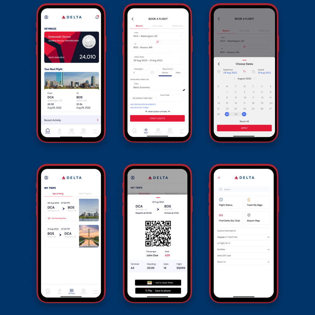
To book a flight on the Delta mobile app, start by opening the app and logging in using Face ID or a 4-6 digit passcode. Once logged in, navigate to the “Book” section at the bottom of the screen.
Select your desired trip type (round-trip, one-way, or multi-city) from the available tabs. Input your departure and arrival cities, select your travel dates using the calendar, and specify the number of passengers. You can also choose to view prices in dollars or miles and refine your search using additional options like preferred class, refundable fares, and event codes.
After entering your travel details, click “Find Flights”. You can choose to view prices in USD, miles, or a combination of both. Select your preferred cabin class (e.g., Main Cabin, Delta Comfort+) to view available flight options.
Once you’ve chosen your flight, you’ll typically be presented with a seat map. The map will visually display available seats, highlighting those with extra legroom, exit row, or other amenities.
- Seat Types: Airlines often categorize seats into different types like standard economy, extra legroom, exit row, and premium economy. Each type has its own set of features and associated costs.
- Seat Selection Fees: Many airlines charge fees for selecting specific seats, especially those with preferred locations.
- Group Seating: If you’re traveling with companions, you can often select seats together.
Improving the Delta Mobile App User Experience
Simplify and Clarify the Booking Interface
- Consistent UI Elements:
- Standardize the input fields for all search criteria (destination, dates, passengers, etc.) using a consistent design system.
- Employ the same type of input element (text box, dropdown, date picker) for similar information.
- Clear Visual Hierarchy:
- Organize search criteria into logical groups or sections to improve readability
- Use clear headings or labels to differentiate between sections
- Prioritize essential information and Minimize clutter
- Enhanced Tab Design:
- Increase tab text size and improve contrast for better visibility
- Apply a consistent color scheme to all tabs for a unified look
- Streamline Information:
- Remove less relevant options like “add certificates or eCredits” from the initial search screen.
- Consider placing these options in a separate section or step in the booking process.
While outlining the steps for checking in for a flight, I identified a usability issue with the app’s interface. The “My Trips” function, essential for checking in, is inconsistently placed: once at the top of the screen and again at the bottom. This creates unnecessary user confusion and navigation difficulty.
To enhance user experience, I recommend replacing the top row of small text menu options with four distinct buttons. This will improve visibility and clarity, making it easier for users to locate the “My Trips” function. Additionally, incorporating icons alongside the bottom menu options would provide visual cues, further enhancing usability.
By implementing these changes, the app’s navigation will become more intuitive and efficient.
Finding Your Trip and Checking In
The process of finding a trip could be streamlined by simplifying the search options. A single input field for a confirmation number, or the option to search by name and departure date, would be more user-friendly.
The “Check In” button should be made more prominent with a brighter color and potentially larger size to guide users through the process.
Baggage Information
The excessive amount of explanatory text on the baggage page can be condensed. Key information about baggage policies and procedures can be presented in a more concise format, perhaps with a tooltip or expandable section for additional details.
Seat Selection and Boarding Pass
The “View/Change Seats” button can be shortened to “Seats” for brevity. The “Add to Wallet” option for the boarding pass should be a prominent button rather than an understated link. Information like SkyMiles member, zone, and seat number should have clear visual hierarchy to improve readability.
Overall Recommendations
- Simplify language: Use clear and concise language throughout the app.
- Prioritize visual hierarchy: Use size, color, and spacing to guide user attention.
- Reduce clutter: Remove unnecessary text and elements to improve screen clarity.
- Optimize button placement: Place important actions in prominent locations.
- Leverage white space: Use white space effectively to improve readability and visual appeal.
Disclaimer
This application redesign is fully a user experience case study. The application is solely owned by Delta Airlines. From this entire project I am giving a user experience feedback and redesign.
Information Architecture
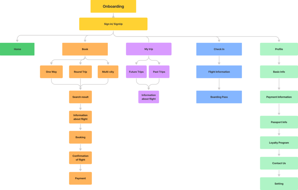
High Fidelity