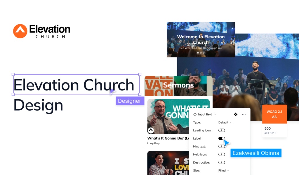
Elevation Church is a large church with a large online following. Their website and app are important tools for connecting with their members and the wider community. As a UI/UX designer, I was tasked with identifying two UX changes that could be made to the mobile app to improve the user experience.
Understanding the Problem
The task is to identify UX changes that could be made to the Elevation Church mobile application. The first change is to improve the Home page. The current home page is an infinite scrolling of all the sermons that had been preached and uploaded, no direction is given to users when they open the application for the first time. The structure of that layout could make users feel overwhelmed.
The second change is a set of features informed by user research. The features were identified through a series of user interviews, which allowed me to gather feedback from real users about their needs and pain points. The features are designed to address these needs and pain points, and to improve the overall user experience of the website or app.
Empathize
The user research for this project was conducted through a survey and user interviews. The survey was distributed to a sample of users, and the user interviews were conducted with a small group of users. The survey and user interviews asked users about their experience with the app and the features they would like to see.
Interview Questions
Please consider the following factors in your response:
The app’s overall design and usability
The app’s features and functionality
The app’s content and user experience
The app’s overall impact on users
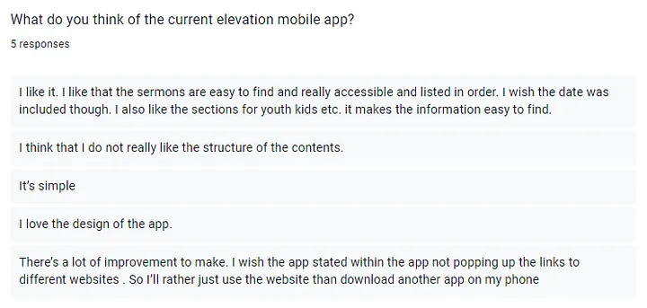
What are your thoughts on the current Elevation mobile app?
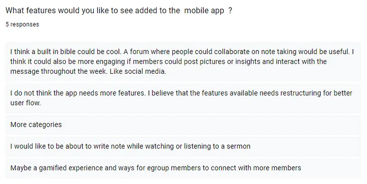
What new features would make the mobile app more useful to you?
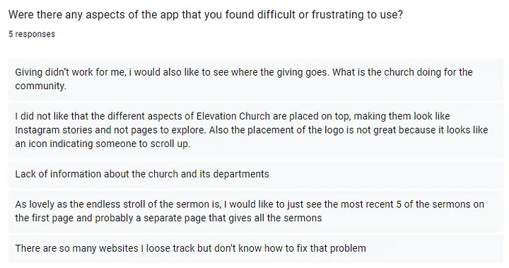
What aspects of the website did you find challenging or annoying to use?
What is your overall impression of the Elevation Church mobile app?
Main takeaway
The Elevation mobile app has received mixed reviews from users. While some users appreciate the app’s ease of use and it’s ability to provide access to sermons, and others have criticized the app’s structure and have expressed a desire for more features.
Specifically, users have suggested that the app could be improved by:
Improving the app’s structure. The app’s current structure can be confusing and difficult to navigate. The app could be improved by organizing the content in a more logical way and by providing better search functionality.
Adding more features. The app could be improved by adding more features, such as the ability to take notes during sermons.
Fixing the app’s links. The app sometimes opens links to external websites, which can be inconvenient. The app could be improved by fixing these links so that they open within the app.
User feedback suggests that the app could be improved in this following areas:
Navigation: Users have found the navigation on the app to be confusing and difficult to use. They would like to see a more logical organization of the content and better use of headers and subheaders.
Information about the church: Users have requested more information about the church and its departments. They would like to see a more comprehensive overview of the church’s mission, vision, and values.
Sermons: Users have suggested that the app should display the most recent five sermons on the first page, with a separate page for all sermons. They would also like to be able to filter the sermons by topic or speaker.
Overall, the feedback suggests that the elevation church app could be improved by making it more informative.
Based on the survey, the following features could be added to the app:
A built-in Bible. This would allow users to easily access the Bible while using the app.
The ability to write notes while watching or listening to a sermon. This would allow users to take their own notes on sermons without having to switch between apps.
More categories. This would make it easier for users to find the content they are looking for.
Ways for egroup members to connect with more members. This would help egroup members to connect with each other and build relationships.
Overall, the feedback suggests that the Elevation mobile app could be improved by adding more features and making the app more engaging. The specific features that users would like to see added vary, but the general consensus is that the app could be improved by making it more interactive.
Solution
Based on the user research I conducted, I was able to identify the following design solutions:
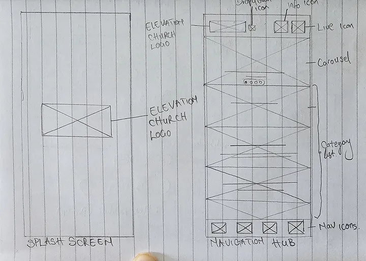
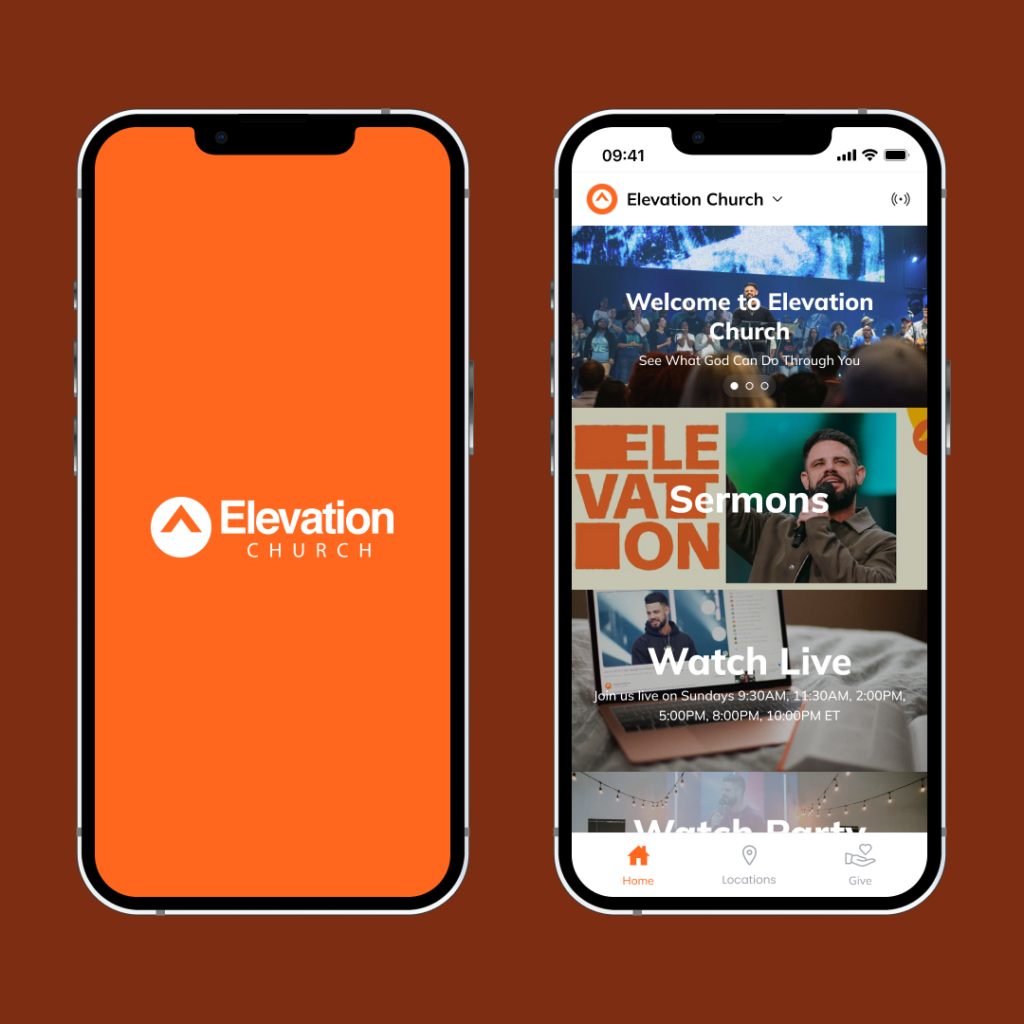
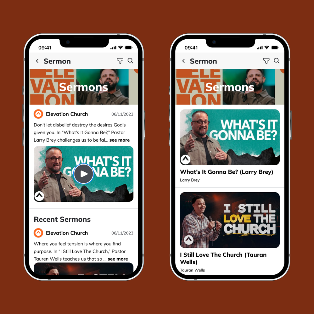
The first change made to the app was to create a new Home page that serves as a navigation hub for users. This page was designed to be visually appealing and easy to use, with clear calls to action that guide users to different aspect of the app. The Home page also includes a section for users to click to go to the sermons page.
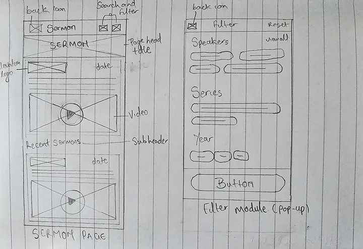
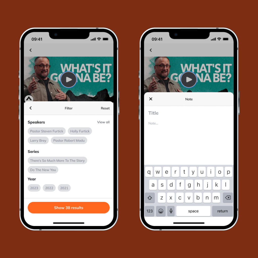
The Sermon page was redesigned to be more user-friendly. The infinite scrolling of the sermons was removed to reduce visual clutter and make it easier for users to find the sermons they are looking for. A search and filter was also added to the Sermon page, which allows users to search for sermons by Speakers, Series and year.
Here are some specific examples of how the changes improved the user experience:
The new Home page is more visually appealing and easy to use, with clear calls to action that guide users to the different aspect of the app.
The Sermon page is now easier to navigate, with a search and filter feature that makes it easier for users to find the sermons they are looking for.
Overall user experience of the app is now more streamlined and efficient, making it easier for users to find the content they are looking for.
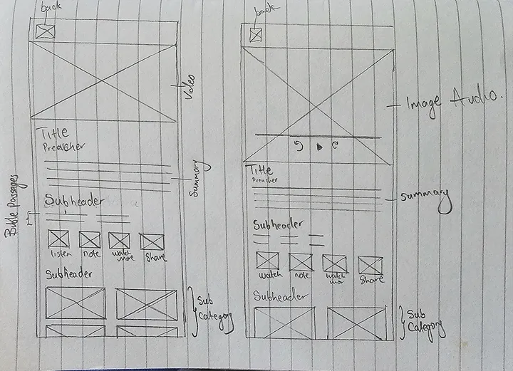
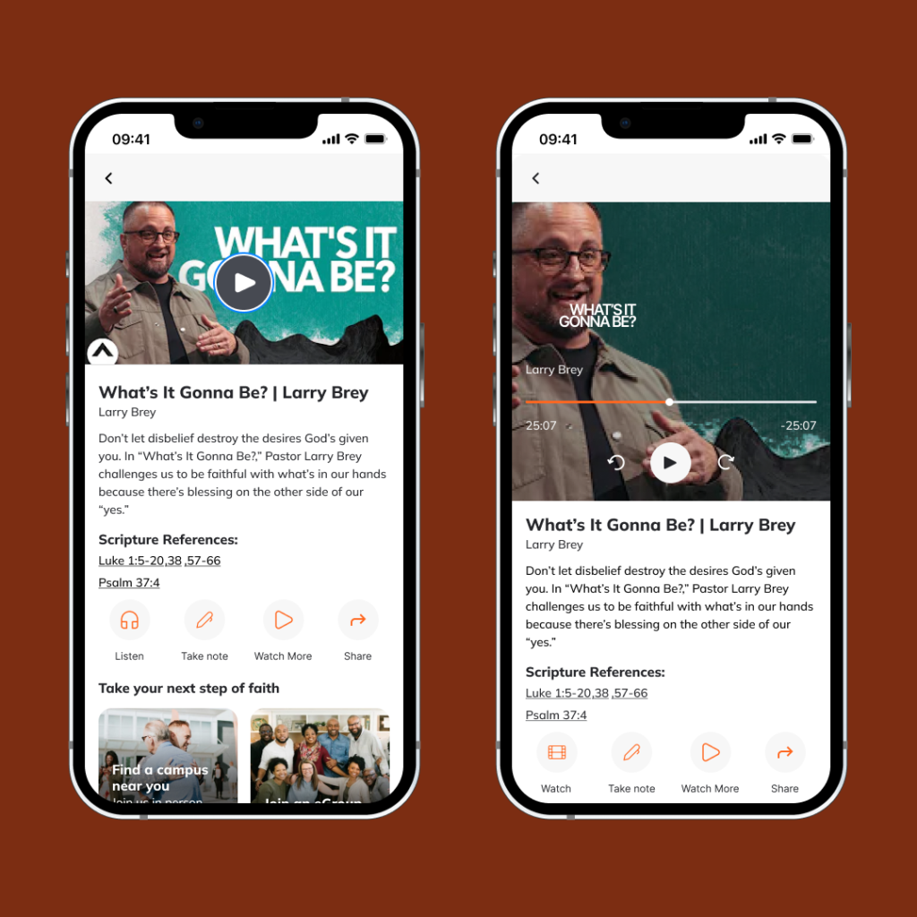
The second change made to the app was to add a set of features informed by user research. The user research revealed that users want to be able to follow along with the sermons and take notes. The first feature is the Bible reference section. A Bible reference section was added to the app, which provides users with the Bible passage that is being preached. This allows users to read the Bible while watching or listening to the sermon, which can help them follow along and understand the sermon better.
The second feature is a note-taking section. A note-taking section was added to the app, allowing users to take notes while watching or listening to the sermon. This can help users remember the key points of the sermon and refer back to them later.
” A short pencil is better than a long memory”
” Jeremiah 30:2 — Thus speaks the Lord God of Israel, saying: ‘Write in a book for yourself all the words that I have spoken to you.”
” Habakkuk 2:2 — Then the Lord answered me and said: “Write the vision and make it plain on tablets, that he may run who reads it. “
Low Fidelity Sketch
I have identified several key features that I believe would improve the user experience of the Elevation App. These features include a navigation hub, a filter and search function on the sermon page, a note-taking feature on the video page, access to the Bible passages that are being preached, an audio page for users who are unable to watch the video, and interactivity features. Based on my research findings, it is imperative to prioritize the preservation and consistency of existing app’s aesthetic quality throughout the process of implementing new features. By upholding the established visual design, including aspects such as color schemes, typography, iconography, layout, and overall style, users can experience a seamless transition when interacting with the enhanced functionalities. This approach ensures that users maintain a sense of familiarity and reduces the risk of confusion or dissatisfaction that may arise from abrupt or inconsistent design changes. By meticulously aligning the new features with the app’s current aesthetic, developers can sustain a cohesive user experience and reinforce the overall branding and identity of the application.
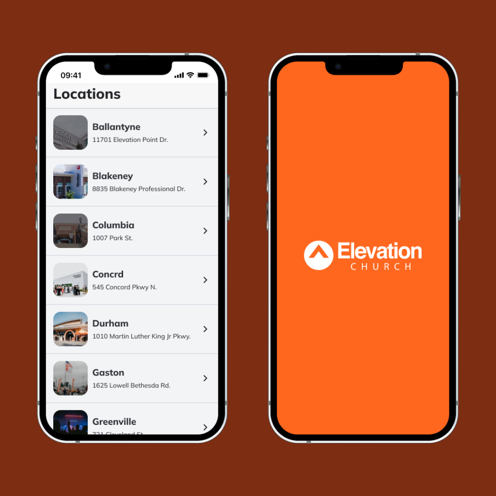
High Fidelity
Here is the link to an interactive prototype that represents my final deliverable. You are welcome to explore and interact with it to get a better sense of its functionality.
In conclusion, the changes made to the Elevation Church app have improved the user experience in a number of ways. The new Home page is more visually appealing and easy to use, and the Sermon page is now easier to navigate. The addition of the Bible reference section and the note-taking section has also made it easier for users to follow along with the sermons and take notes. These changes have made the app more user-friendly and efficient, and they have helped to improve the overall user experience.
I believe that these changes are a valuable contribution to the Elevation Church app. They have been informed by user research, and they have been designed to improve the user experience. I am confident that these changes will be well-received by users, and I hope that they will help to make the app more popular.